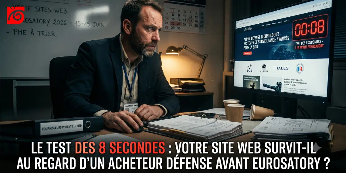
On Monday morning, a buyer from a large corporation or a procurement manager is planning their tour of Eurosatory. Sixty SMEs on their list, one morning to make a decision. They open your website, scan it, and decide. In a matter of seconds, you’re either on their shortlist or off it—with no recourse and no meeting scheduled. It’s not your booth that’s playing this game—it’s your homepage. And most SMEs in the defense industry invest tens of thousands of euros in the former without ever checking what the latter says. This article gives you the checklist to take back control tonight.
Picture this: A potential customer is getting ready to visit your trade show booth. They don’t know your company yet. They type in your name, open your website, and that’s when everything happens very quickly.
Too quickly, in fact. A visitor decides in about 50 milliseconds whether your site seems credible, and that judgment, formed in a fraction of a second, aligns with that of longer observations. In other words: before reading a single word of your value proposition, the buyer has already formed an opinion about your credibility.
This snap judgment isn’t just a designer’s whim. According to the Stanford Web Credibility Project, 46.1% of users judge a page’s credibility based on its visual appearance, not its content.Form takes precedence over substance in this decision. And this decision is made while you, the executive, are in a meeting or on the road.
This article aims to address that paradox. You’ve been preparing for Eurosatory for months. You’ve been working on your booth, your brochures, and your product demonstrations. But your website is already welcoming buyers—24 hours a day, without any guidance or quality control.
The first misconception to let go of: thinking that a buyer reads your website. They don’t. On average, a visitor reads only 20% of the words on a page during a visit. The rest, they just skim over.
This scan is not random; it is focused. Content located above the fold receives the bulk of the attention (57% of viewing time), while the second screen gets about a third of that; the closer a piece of information is to the top of the page, the more likely it is to be read. In short: if your credibility signal doesn’t appear immediately, it doesn’t exist.
And the verdict comes quickly. The first ten seconds of a visit are critical in determining whether a user stays or leaves. The likelihood of leaving is very high during those first few seconds, because users are extremely skeptical, having encountered countless poorly designed pages in the past. Your buyer persona is that skeptical user—only worse: they have sixty sites to sift through and no time to waste.
The good news? The same body of research provides a roadmap. To capture several minutes of attention, you need to clearly communicate your value proposition in ten seconds. The entire success of your website leading up to the trade show hinges on this one sentence.
The current situation makes this even more critical. The 2026 Eurosatory trade show will take place from June 15 to 19 at Paris Nord Villepinte. This record-breaking edition will bring together more than 2,300 exhibitors. In the weeks leading up to the event, buyers are planning their itineraries. They’re filtering through options. They’re doing their research. Your website has never been viewed by the right people as much as it is now, and this is precisely the moment when you aren’t monitoring it.
However, the sector is undergoing a profound transformation. The 2026 edition marks the expansion of the Defense Industrial and Technological Base to include civilian technology companies and the influx of private funding at the early stages. Competition is intensifying, and new entrants are flooding in. SMEs are recognized as key players in innovation. For an SME, standing out from the crowd has never depended so much on its ability to quickly prove its credibility.
The paradox can be summed up as follows: nearly all of an SME’s energy goes into the physical booth, with almost none devoted to ensuring that their website’s messaging aligns with the trade show week. Yet the website always comes before the booth. It is the website that determines whether a buyer will schedule a meeting with you or move on to the next one.
Here is the checklist. Each item is evaluated in a matter of seconds:passorfail. There are no shades of gray—that’s by design. A buyer doesn’t mince words; they make a decision.
The question:What do you do, and for whom? Can it be read in three seconds without scrolling?
This is the most important test, because the first line is what the user sees first; the purpose of your page must be clearly stated there.
It’s a failure if:the slogan is empty, it’s full of internal jargon, or it’s a two-line phrase that makes people think too hard. If the buyer has to guess what you do, they’re already gone.
The question:Is the word “defense” (or an explicit equivalent: BITD, military, sovereign) immediately visible above the waterline?
This matters because the closer a piece of information is to the top of the page, the more likely it is to be read. Your affiliation with the industry shouldn’t have to be earned.
Failure if:you have to scroll or dig through the menu to realize that you're addressing the defense market.
The question:Are there any identifiable defense clients or partners?
Peer validation remains one of the quickest ways to build trust for a scanning mind. Logos and quotes create instant trust, especially when placed above the fold; this validation by a recognized third party reduces skepticism. In the BITD, seeing a name like Airbus Defense & Space, Arquus, KNDS, Thales, MBDA, Naval Group, Safran, or the DGA radically changes the way the text is perceived.
Failure if:no logo, or only non-brand-related references that blur your positioning.
The question is:Are the necessary authorizations, qualifications, and industry certifications in place, without being displayed like a wall of trophies?
The discerning buyer looks for signs of quality, not just decoration. Quality takes precedence over quantity.
Failure if:they are missing (raising doubts about your eligibility), or thrown in haphazardly and illegible (giving the impression of overcompensation).
The question:Does a product or service page really show what you're capable of?
There are two pitfalls here. Users quickly get overwhelmed by a wall of text with no breathing room. Too much empty marketing talk drives them away; so does too much raw technical data.
Failure if:a marketing description lacking substance, or, conversely, a technical spec sheet so dense that only an engineer on your team can make sense of it.
The question:Is the leader identified, with a photo and a credible background?
In an industry where trust and discretion matter, a personal touch is reassuring. An impersonal page written in the third person sends a signal of aloofness.
Failure if:page is missing, or generic text with no name or face. The buyer wants to know who they’ll be dealing with.
The question:When was the last time you made a public appearance?
A stagnant website is cause for concern. It suggests a company that’s at a standstill, or a team that doesn’t have the time. Yet buyers also look for these signs of vitality.
Failure if:nothing since 2023. A website that isn't active is seen as a company that's no longer in business.
The question:Can the buyer find a direct contact in less than five seconds?
This is the element that turns interest into a call to action. Making it difficult is tantamount to undermining the very purpose of the visit. A CTA that’s hard to spot is one of the main reasons people leave a page.
Rejected if:generic form, no name, no job title, no way to contact you.
Add up your points. The result will give you a clear picture of where you stand.
| Score | Diagnosis | Action |
|---|---|---|
| 8/8 | Your website is doing its job in terms of sales. | Keep feeding it, especially the fresh ingredients. |
| August 6–7 | Above the BITD average, but with 1 or 2 flaws. | Fix this before the trade show: a weak point could cost you a spot on the shortlist. |
| 4-5/8 | You remain a mystery to most of the buyers who are just discovering you. | Urgent action needed before Eurosatory. |
| < 4/8 | Your website is working against you. | A simple placeholder page is better than a website that undermines your credibility. |
One point is worth emphasizing. A poor score isn’t neutral—it’snegative. No matter how advanced your technology is or how relevant your solution may be, if your website looks outdated or confusing, visitors will move on, often without giving you a second chance. Your industrial excellence won’t shine through if your website contradicts it.
You’ve identified some shortcomings, but the trade show is fast approaching. The temptation to start from scratch is a bad idea. Here are three high-impact strategies you can implement without a complete overhaul.
Tip 1 — The opening sentence. Rewrite your headline in an hour. Put it to the “three-colleague test”: can they understand what you do in three seconds? Post it online that same evening. This is the most effective element, because visitors spend 80% of their reading time above the fold.
Correction 2 — Logos and credentials. Move existing elements above the fold. No need for a new design—just a clear hierarchy. Place your most important information at the top left, where the reader’s attention is focused.
Tip 3 — Make the contact personal. Add a name, a title, and a photo. This alone will significantly boost credibility, because you’re turning an anonymous entity into a recognizable person.
What not to do 15 days before the event: launch a redesign. You won’t have the results in time, nor will you have peace of mind during the show. Addressing these three critical points is more than enough for Eurosatory. A redesign, on the other hand, should be planned afterward, with a clear head.
Let’s get back to the basics. Your website doesn’t “sell” in the traditional sense. It filters. Faced with a buyer who scans, makes a judgment in 50 milliseconds, and leaves in ten seconds, your homepage either qualifies you or disqualifies you. Before Eurosatory, it will inevitably do one or the other. You won’t get to choose which: the 8-point grid will tell you.
And that’s precisely where the problem goes beyond the technical. A vague headline, poorly organized evidence, an invisible defensive positioning: these aren’t web design glitches. They’re symptomsofabrand strategythat wasn’t designed with the decision-maker in mind. Fixing these three points before the trade show will save the day. But building a presence that consistently attracts the right audience requires a different level of work: one focused on positioning, messaging, and overall consistency.
That is exactly the mission of Capital Confiance & Expérience by Autour de l’Image. While the 8-second test diagnoses, the Engine structures: it aligns your messaging, your evidence, and your visibility so that every touchpoint—starting with your website—builds your authority rather than undermining it. Ahead of a pivotal event like Eurosatory, this is the difference between facing the 8-second verdict and shaping it in your favor.
Try it tonight. Eight seconds. You’ll find out if your website is your best salesperson—or your worst.


