Fruit de notre expertise en identité visuelle, notre nouveau bloc-marque incarne l’esprit et les valeurs de notre agence.
Au-delà du design et de l’esthétisme, le choix des couleurs, du logo, de la typographie et de la signature de marque répond à une symbolique bien précise. C’est ce que nous vous proposons de découvrir.
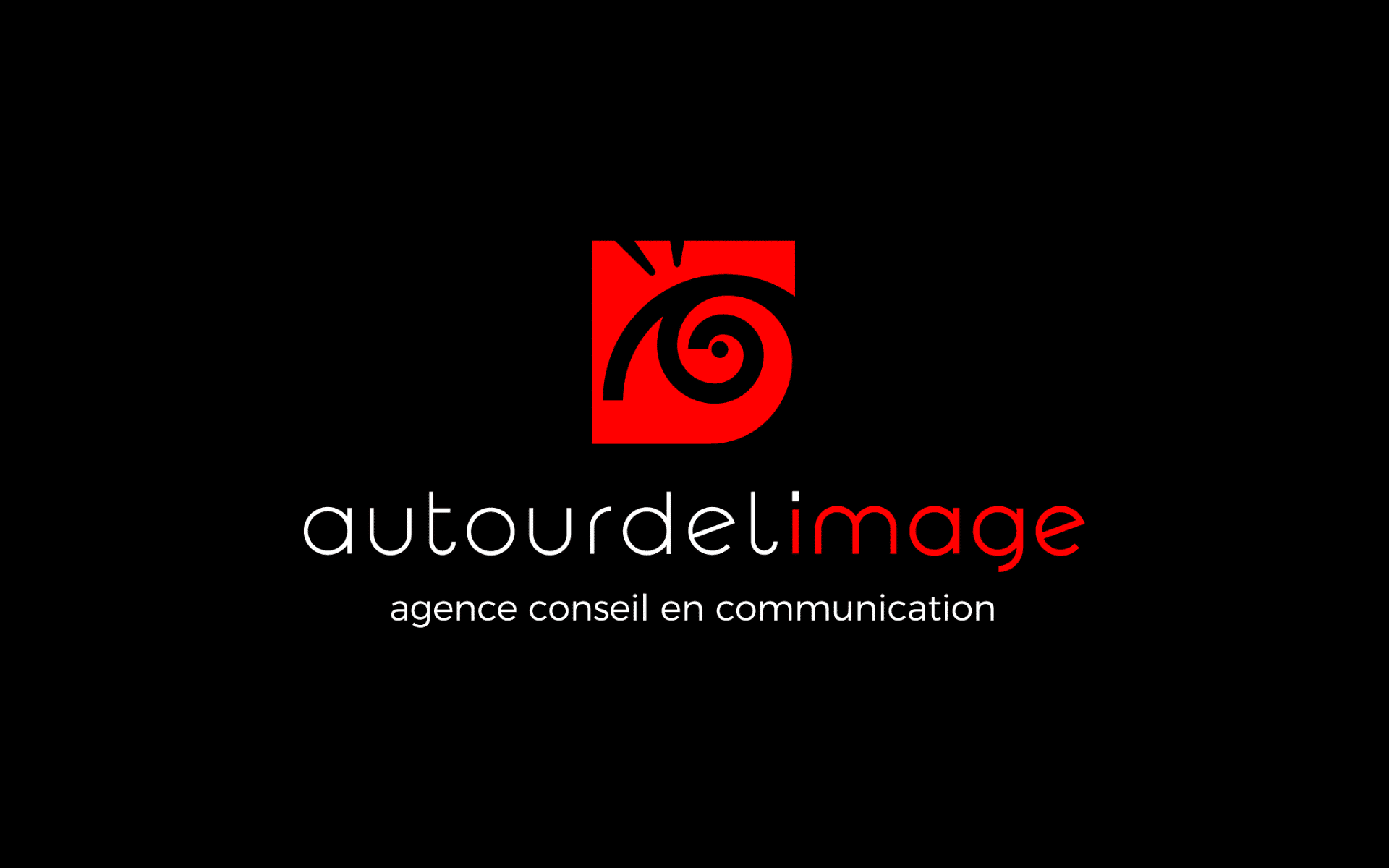
Un pictogramme rouge sur fond noir : ces couleurs n’ont pas été choisies au hasard, mais en adéquation avec notre image de marque.
Dans l’imaginaire collectif, le noir symbolise l’élégance. Associé à la sophistication et au luxe, c’est la couleur intemporelle de la fameuse petite robe noire ou du smoking. Le noir incarne également la simplicité, la sobriété et la rigueur. Ce n’est pas une couleur au sens propre, mais plutôt le résultat de l’absorption de toutes les couleurs, ce qui lui confère une certaine note de mystère.
En psychologie des couleurs, le rouge évoque l’émotion et la passion. La vision de cette teinte stimule l’esprit, améliore la circulation sanguine et nous pousse à passer à l’action. Couleur vive par excellence, le rouge ne laisse pas indifférent et révèle notre caractère. Son intensité reflète l’image d’une équipe dynamique et passionnée, résolument tournée vers l’avenir.
Simple et épuré, le pictogramme rappelle l’esthétique d’un motif tribal. À première vue, c’est la courbe stylisée d’un œil qui attire le nôtre, noire sur fond rouge. Un regard observateur, volontaire et décidé, porté sur la problématique du client pour y répondre le plus efficacement possible. Les deux traits supérieurs représentent les cils, mais aussi la vivacité, la curiosité et l’étonnement. Car se montrer créatif, c’est surprendre l’autre et se surprendre soi-même.
Un second niveau de lecture révèle une spirale. Omniprésente dans l’Univers, de l’infiniment petit à l’infiniment grand, de la double hélice de l’ADN au tourbillon des galaxies en passant par les plantes et les coquillages, la spirale représente le souffle créatif de la vie. C’est le symbole du mouvement, de l’ouverture au monde et aux autres. Ce n’est pas une tornade qui se déplace de façon désordonnée, mais une force qui gravite autour d’un point central, matérialisé par la pupille, et gagne en puissance. Par sa double nature, à la fois axiale et évolutive, la spirale incarne un principe de pérennité.
Le nom de l’agence adopte une typographie plus lisible, à la fois actuelle et intemporelle. Les mots sont liés, car c’est ce qui donne du sens aux idées. Le blanc contraste avec le fond noir. Seul le mot « image » est mis en évidence par la couleur rouge, qui rend cet élément vivant, comme l’image de marque qui se construit jour après jour. C’est notre raison d’être et notre cœur de métier : tout tourne Autour de l’Image.
Pas de slogan pompeux, de promesse creuse ou de grand concept. La simplicité est de mise avec une signature de marque sobre et efficace qui se résume à l’intitulé de notre métier : agence conseil en communication.
Autour de l’Image vous accompagne dans la création de votre logo et charte graphique. Nous concevons et réalisons pour vous un bloc-marque sur mesure, reflétant vos valeurs et votre activité, en cohérence avec votre cahier des charges et votre plateforme de marque.